Screenshot editor
Compose App Store and Google Play screenshots on a real artboard, then render every store size at its exact resolution. No account needed — open the editor and start.
The workspace
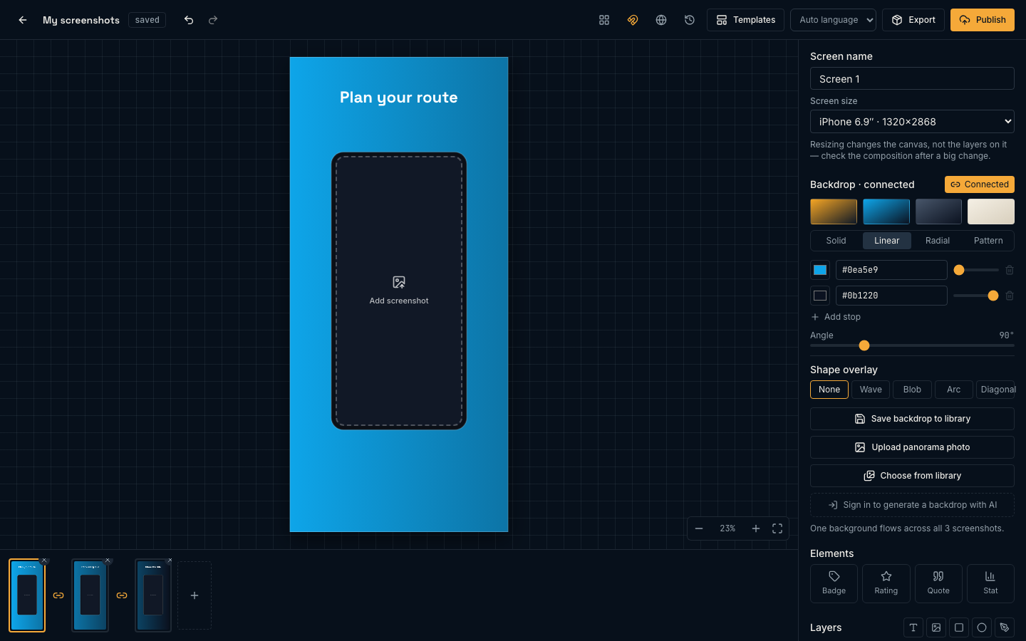
Four regions, and they stay put. The toolbar across the top holds document-level actions. The canvas in the middle is the screen you are working on. The filmstrip along the bottom is every screen in the set. The inspector on the right always edits whatever is selected — the screen itself when nothing is, a layer when one is.
Screens and store sizes
A screen is one artboard at one store-required pixel size. The inspector’s Screen size menu lists the sizes AssetShip renders:
- iPhone 6.9″
- 1320 × 2868 — the size App Store Connect asks for first
- iPhone 6.5″
- 1284 × 2778
- iPad 13″
- 2064 × 2752
- Android phone
- 1080 × 1920 — Google Play
You design at one size and export to all of them; you do not need a separate document per device. Changing a screen’s size changes the canvas, not the layers on it, so check the composition after a big jump — a layout built tall for a phone will have room to spare on iPad.
Adding and reordering
The + at the end of the filmstrip offers three ways to add a screen: Blank screenshot (empty canvas, same size), Same as current (duplicates the design you are on), or From a template…. Drag filmstrip thumbnails to reorder — that order is the order they appear on your store listing. The × on a thumbnail deletes that screen.
Overview mode
With more than one screen, View all screens in the toolbar zooms out to the whole set at once. It is the fastest way to check that headlines sit at a consistent height across the set. Double-click any board to drop back into it.
Backdrops
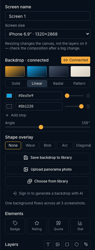
Every screen has a backdrop underneath its layers. Four quick swatches — Dusk, Marine, Ink, Paper — get you a usable gradient in one click, and the tabs below give you the real controls.
- Solid
- One colour, picker or hex.
- Linear
- A gradient stop list — add, remove and slide stops, then set the angle from 0–360°.
- Radial
- Stops plus centre X, centre Y and radius, for a glow behind the phone.
- Pattern
- Dots, grid, stripes or checks over a base colour, with ink colour, scale and rotation.
Photos and generated images
Upload photo puts your own image behind the composition, and Choose from library pulls anything you have already generated or uploaded. Image backdrops get a Crop & position block — zoom 1–4×, horizontal and vertical offset, and Reset crop — so you can frame the photo without leaving the editor. The prompt box at the bottom generates a backdrop with AI; that is the one part of this panel that costs credits and needs an account.
Shape overlays
Independent of fill type, a Shape overlay lays a wave, blob, arc or diagonal across the backdrop, with its own colour, vertical position, opacity and a Flip vertically toggle. This is what gives a flat gradient a horizon line without adding a layer you can accidentally select.
Saving a backdrop
Save backdrop to library stores the recipe — the gradient stops, the pattern settings, the overlay — not a flattened image. Applying it later on a different screen size re-renders it at that size instead of stretching a bitmap.
Connected panoramas
A connected set is one continuous background flowing across several screens, so a listing reads as a single wide image while still being separate uploads. Between every pair of filmstrip thumbnails there is a seam button: click it to Connect these screens into one panorama, click it again to split. The inspector’s Connect set button does the whole set at once.
Once connected, the backdrop heading reads Backdrop · connected and edits apply to the group. Upload panorama photo spreads one wide photo across the run, and shape overlays gain a Span across all screens option so a wave can cross the seams instead of repeating per screen.
Layers
The Layers list stacks bottom-to-top over the backdrop. The row of buttons above it adds one: Add text, Add image, Add rectangle, Add ellipse, Add vector (SVG). Hovering a row exposes show/hide, lock/unlock, bring forward, send backward and delete.
Above those, Elements inserts a pre-composed group in one step — Badge, Rating, Quote or Stat. Each lands as a single undo, so one ⌘Z removes the whole thing.
Position & size
Every layer, whatever its type, has the same transform block: X Y W H, rotation in degrees (∠) and opacity as a percentage (○). Type exact numbers here when you need two screens to match precisely; drag on canvas when you are still deciding.
Text
Text is the part of a screenshot that actually sells the app, so it gets real typographic control rather than a single size box.
- Font
- Inter, Space Grotesk or JetBrains Mono.
- Weight
- Regular 400 through Bold 700, filtered to the weights the chosen family ships. Switching family snaps to the nearest available weight.
- Size & colour
- Points, and a colour picker.
- Italic
- Toggle.
- Alignment
- Left, centre, right.
- Line height
- 0.8–2.2, which is what stops a two-line headline from crowding.
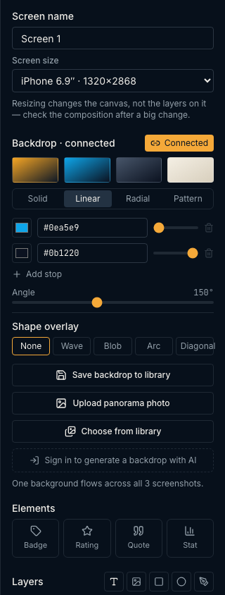
Double-click a text layer on canvas — or press Enter with one selected — to edit in place. The fonts here are the same files the export renderer uses, so what you set is what ships; there is no system-font substitution between preview and PNG.
Shapes and vector layers
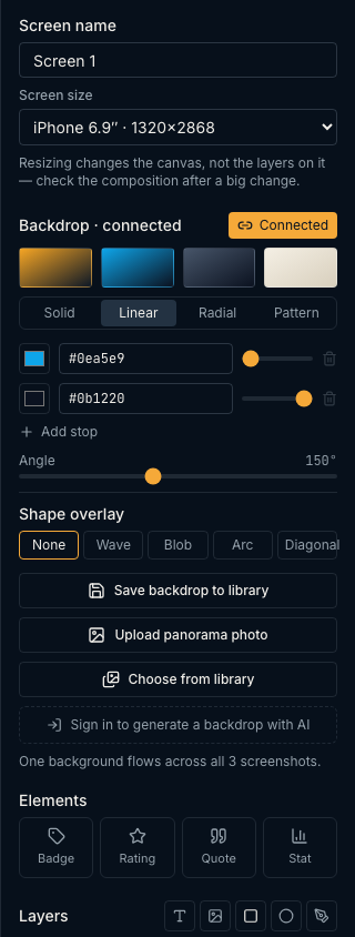
Shapes cover the geometry a screenshot actually needs — cards behind text, pills, dividers, accent marks. The Shape control switches a layer between Rectangle, Ellipse and Star.
- Fill
- Solid colour.
- Stroke
- Colour plus a 0–40 px width. Picking a stroke colour sets a sensible width automatically; Clear removes it.
- Corner radius
- Rectangles only, up to half the shorter side.
Anything else: bring SVG
Add vector (SVG) takes arbitrary SVG markup — any path, polygon, curve or icon set your design calls for — and renders it as a first-class layer. Select it and you get a Colors swatch row that recolours the artwork in place, plus Edit markup to open the source, change it and Apply markup. Dropping an .svg file onto the canvas creates one of these directly.
Fit box to artwork snaps the layer’s bounding box to the artwork’s own aspect ratio, which is usually what you want right after pasting markup.
Images and the device frame
Image layers have a Fit mode — cover, contain, fill or none — a corner radius, and Replace image. Drop a file anywhere on the canvas to add one.
A device layer is the mockup that holds your actual app capture. Drop a screenshot onto the frame and it is cropped to fill the screen area automatically; an empty frame shows an Add your app screenshot target so it is never ambiguous where the capture goes. The drag overlay spells out the rule: drop on a phone to fill it — anywhere else to add an image.
Choosing the hardware
The Device menu on a selected device layer switches between four mockups, each drawn with the hardware that identifies it:
- iPhone · Dynamic Island
- The pill. Current iPhone Pro models.
- iPhone · notch
- The older cut-out, on a slightly longer body.
- Android · punch-hole
- Centred camera dot, squarer corners, no gesture bar.
- Tablet · uniform bezel
- No cut-out, thicker bezel, far squarer.
Switching keeps the width you positioned and re-derives the height from that device’s real proportions, so the hardware never stretches. The cut-out and gesture bar are drawn over your screenshot, which is what makes a mockup read as a specific phone rather than a black rectangle.
Device layers arrive with most templates, and Add device in the layer row drops one onto a screen that has none.
Templates
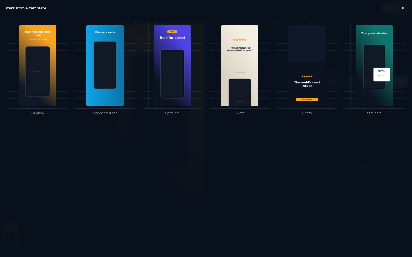
The Templates button opens six starting points. They are ordinary documents — every layer is yours to move, retype or delete.
- Caption
- Headline over a framed device. The workhorse.
- Connected set
- A panorama across several screens, already connected.
- Spotlight
- Device off-centre with a radial glow behind it.
- Quote
- A pull quote with attribution.
- Photo
- Photographic backdrop with minimal type.
- Stat card
- A number worth bragging about, set large.
Snapping, zoom and shortcuts
Dragging a layer shows alignment guides against the artboard edges, centres and the other layers, and snaps to them. The magnet button in the toolbar (Toggle snapping) turns that off when you need a deliberately off-grid position. Zoom controls sit bottom-right, with Fit to view and a percentage button that resets to 100%.
| ⌘Z / Ctrl+Z | Undo |
| ⇧⌘Z / Ctrl+⇧Z | Redo |
| ⌘A / Ctrl+A | Select every selectable layer |
| Delete / Backspace | Delete the selection |
| Escape | Deselect |
| Arrow keys | Nudge 8 px |
| ⇧ + Arrow keys | Nudge 40 px |
| Enter | Edit the selected text layer in place |
| Double-click | Edit text, or enter a board from overview |
| ⇧ / ⌘ / Ctrl + click | Add to the selection |
| Space + drag | Pan the canvas |
| ⇧ while resizing | Keep the aspect ratio |
| Alt while resizing | Resize from the centre |
| ⇧ while rotating | Snap to 15° |
Next
- Exporting & sizes — render the set at every required resolution.
- AI images, upscaling & library — generate backdrops and reuse them across projects.
- Projects & version history — save to the cloud and snapshot before you experiment.